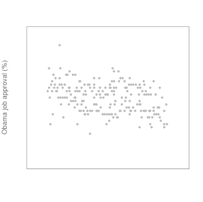
First we plot approval (app) against date (daten). We also specify a few other things. ylim=c(40,80) specifies that the y axis extends from 40 to 80. xlim=c(-3,210) might seem odd, but we need extra space on the left. pch=16 plots dots, and col="gray" makes them, well, gray.
cex.lab=1.25 and cex.axis=0.75 make the axis labels 1.25 times larger than normal, and the axis value labels 0.75 times normal size. The col.lab = "#777777" makes use of R's ability to accept hexidecimal color specifications, such as those used by web designers. It's a very useful function.
I specified that the x-axis label say nothing, while the y-axis label be "Obama job approval (%)". xaxt="n", yaxt="n" tell R not to plot either the x or y axes.
plot (app~daten, ylim=c(40,80), xlim=c(-3,210), pch=16, col="gray", cex.lab=1.25,cex.axis=0.75, col.lab = "#777777", xlab="",ylab="Obama job approval (%)", xaxt="n", yaxt="n")
This yields a very sparse-looking scatterplot:

Next we add the axes:
axis(1,at=c(-3,28,56,87,117,148,178,209),lab=c("Jan 09","Feb 09","Mar 09","Apr 09","May 09","Jun 09","Jul 09", "Aug 09"),
col.lab="#777777", col.axis="#777777", tck=-0.02, cex.axis=0.75)
axis number 1 is the bottom, 2 is the left, etc. All I'm really doing is specifying where the value labels for each axis should be, and what the labels should say, i.e., month abbreviations - "Mar 09" instead of "03/01/09". The "tck" parameters control the length and direction of the tick marks.
axis(2, at=c(40,50,60,70,80),
col.axis="#777777",
las=2, tck=-0.02,
cex.axis=0.75)
"las=2" tells R to rotate the y-xis labels 90% clockwise so they are more legible.
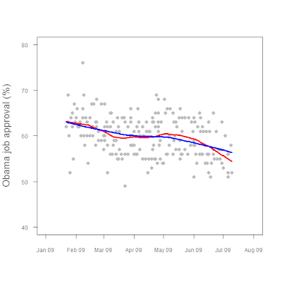
Then we add our LOWESS fit lines:
lines(lfit1, col="red", lwd=3)
lines(lfit2, col="blue", lwd=3)
and we're done!

Post a Comment 0 comments: